Written by CIMA’s Spring 2021 intern, Clara Apostolatos.
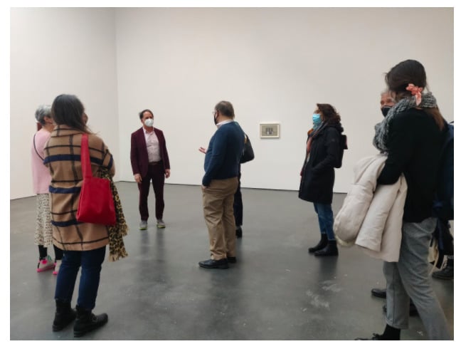
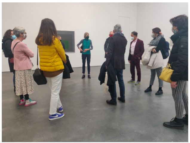
On Friday March 19th, CIMA members were given a walking tour of the David Zwirner Gallery’s current exhibition Albers and Morandi: Never Finished, led by the exhibit curator David Leiber and CIMA Founder and President Laura Mattioli. This exhibit explores the visual resonances and contrasts between two of the twentieth century’s greatest painters, German-born Josef Albers (1888–1976) and Italian painter Giorgio Morandi (1890–1964). They are each known for their serial work of singular motifs: Albers experimented with chromatic combinations and perceptual effects in his nested square format, and Morandi created subtle, tonal still-lives of everyday objects such as humble vases and bottles.
To borrow from exhibit curator David Leiber, “the connections between the two artists open up like a good bottle of wine,” elucidating how the two artists’ daily acts of devotion to their individual serial subjects allowed each to highlight the essence of color and the endless possibilities of their respective visual motifs. This exhibit puts each artist’s distinctive treatment of color, shape, form, morphology, and seriality in dialogue.
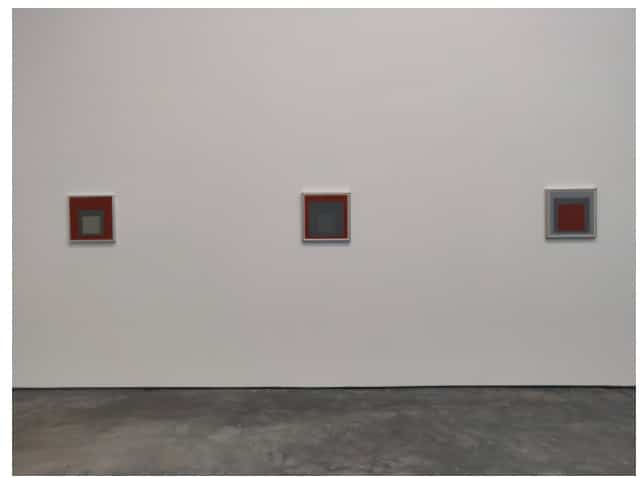
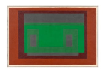
Next to Morandi’s tonal subtlety, Albers’s high-contrast color pairings take on a more nuanced, expressive side. His serial practice of producing hard-edged abstract paintings was anchored by his interest in the mutability of colors—that is, how colors change from one painting to the next, depending on which colors they’re set against. Leiber drew our attention to several pairings of paintings with similar colors and compared their subtle differences in vibrancy, depth and tonality. As an example, the wine-red hue in looks muddier or murkier when set against the bright red on the left (Study for Homage to the Square, 1965), while the an almost identical color red takes on a brighter tone when paired with a gray background (Homage to the Square [Entrez], 1964). This careful attention to color theory was an integral aspect of Albers’s practice: “Simultaneous contrast is not just a curious optical phenomenon—it is the very heart of painting.”
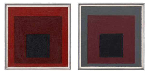
Homage to Square pieces, Albers produces a spatial ambiguity that draws you in as a viewer and invites you to analyze the elements of proportion and space like one would with landscapes. While they appear to be stacked squares painted successively over each other, in reality each tone is painted by itself, so that any illusion of depth or perception between the squares is optical and not designed by Albers. This play with space, depth and perspective through abstract language is further illustrated in the 1958 Untitled (Variant/Adobe). As one of the larger paintings in the exhibit and featuring a palette inspired by the southwest and Mexico, this artwork stands out because of its landscape format, which diverges from Albers’s square motif. The green shape appears to be floating above the gray and semitransparent, when in reality Albers is using a different shade of green to produce this hovering effect. This painting demonstrates Albers’s mastery of color theory to create illusory, perceptual effects.
Conversely, the exhibit invites us to consider the conceptual side of Morandi’s still-lives. For Morandi, the placement of an object is more important than the choice of object itself. Each vase, pan or pot presents itself like a figure on a stage, functioning as surrogates for feelings, memory, or atmospheric experience. Morandi once said, “I am essentially a painter of the kind of still life composition that communicates a sense of tranquility and privacy, moods which I have always valued above all else.”
Leiber invited us to look critically at Morandi’s paintings and notice the small irregularities and incongruencies in composition. The shadows, when added, do not make sense sometimes or do not align with the constructed perspective. This is sometimes set-off by the seemingly monotone background that blends together table tops and walls, in effect making the objects appear to be floating in space due to the unlikely perspective. Moreover, the everyday objects are rendered in anti-dimensional tones, the surface dull and flattened. In this sense, his paintings break from the still-life tradition of showing mastery through fashioned perspective, depth, and light reflections.
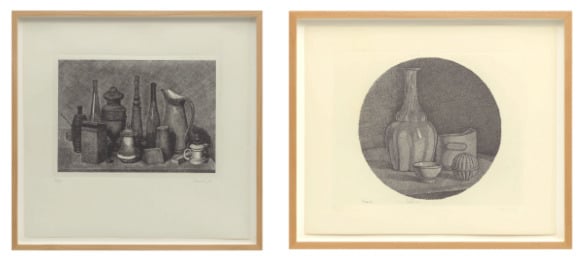
Morandi’s prints, exhibited together in the last room of the gallery, demonstrate Morandi’s technical abilities to produce representational still-lives. Adjacent to the tranquil, atmospheric haze in Morandi’s serial paintings, the prints heighten the uniquely introspective approach Morandi developed towards still-life painting and dedication towards developing a singular and trademark style in the field.
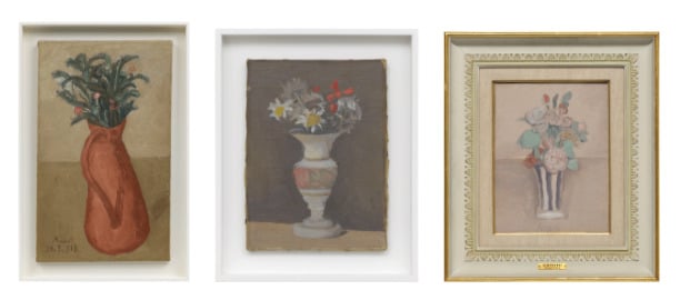
Laura Mattioli also drew our attention to the few paintings of flowers in vases included in the exhibit, a rare and symbolic motif among Morandi’s paintings for he would only paint flowers if gifting the artwork to a friend, partner or close acquaintance. These particular paintings are coloured by a warm and sentimental air, the usual dreamlike imagery with eerie lighting is eclipsed by signs of flora life and the sentimentality of a gifted bouquet.
Walking through the exhibit, we can see how both artists were very much interested in and experimented with perception—Alberti adopting a more abstract visual language and Morandi focusing on the optics of space and tonal shifts. With each new encounter to one of their serial works, we get a sense of the immense dedication and meditation that fueled these lifetime projects. The title of the show alludes to this ongoing and evolving practice of painting, as well as the never-ending aspect of looking and finding something new in Morandi’s and Albers’s paintings.